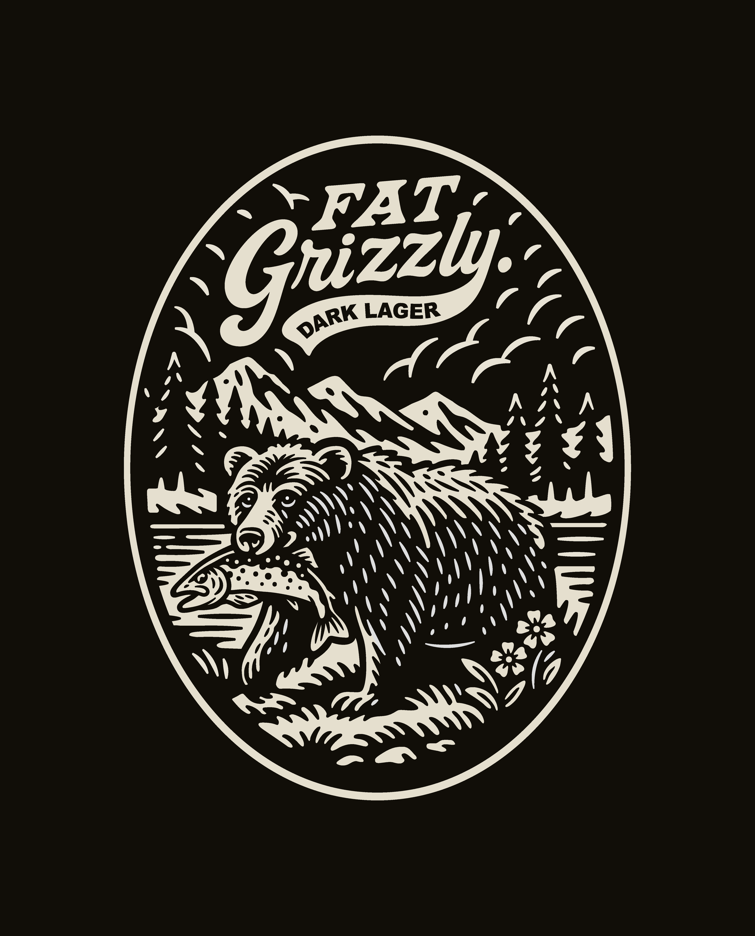
FAT GRIZZLY
DARK LAGER
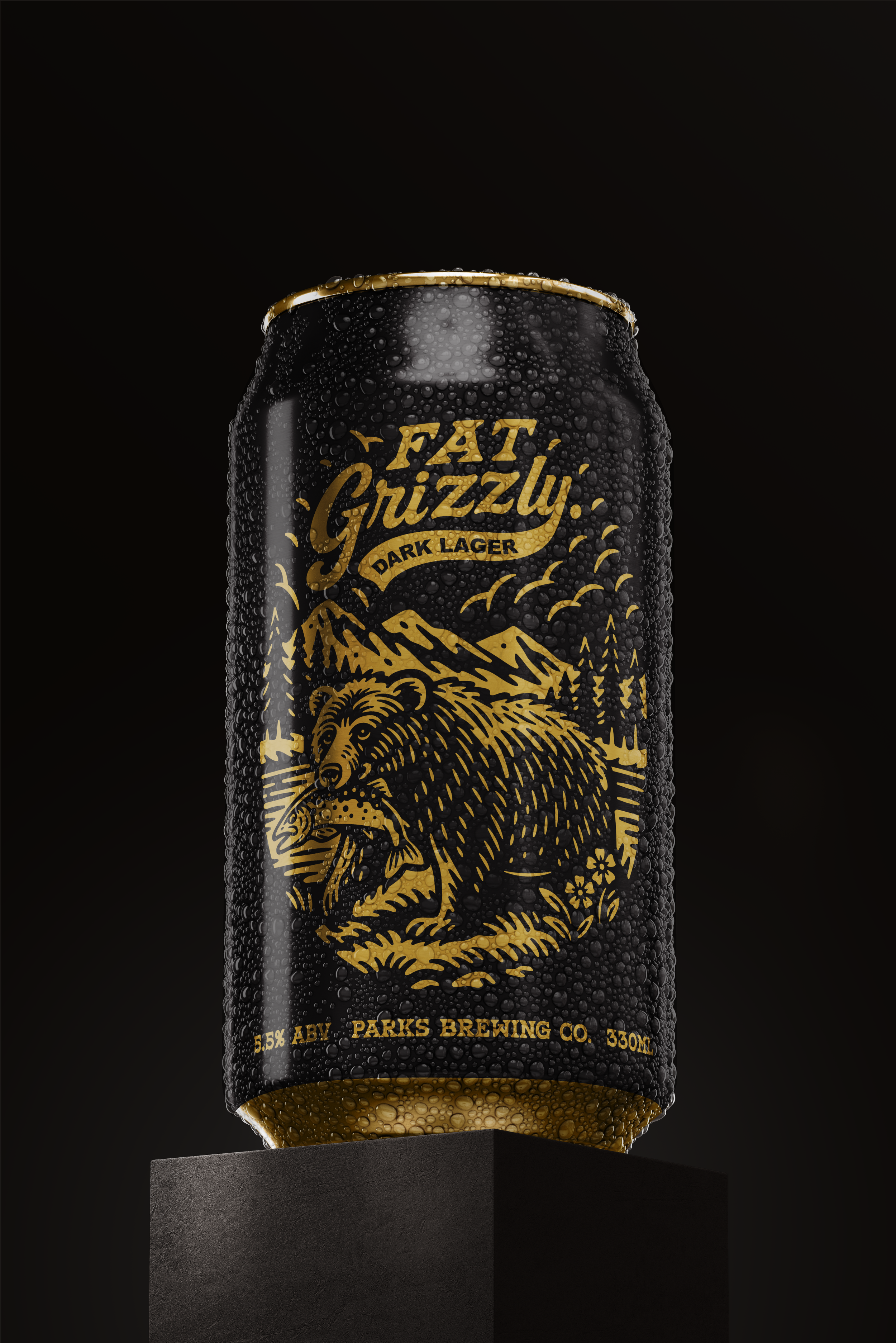
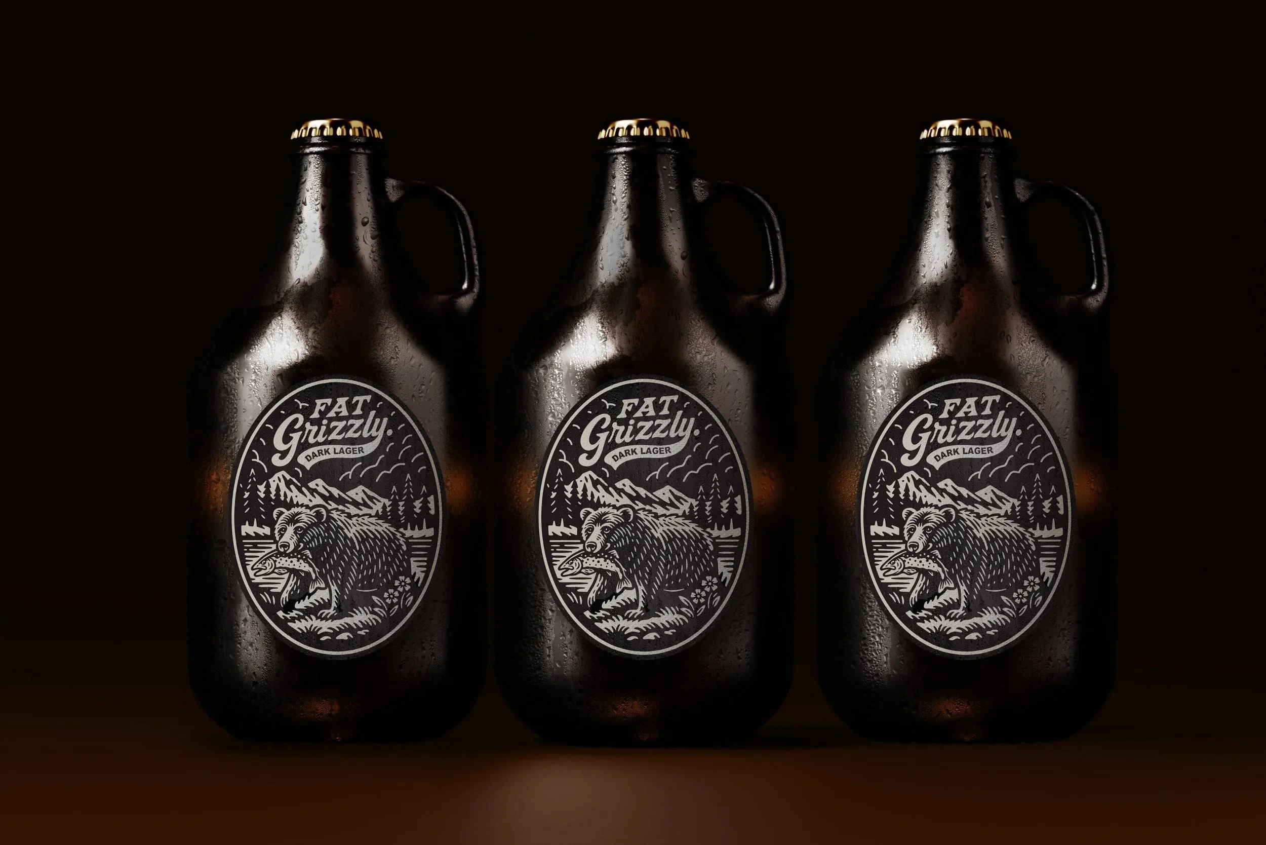
Branding and packaging for Fat Grizzly Dark Lager, built around a bold, character-led identity.
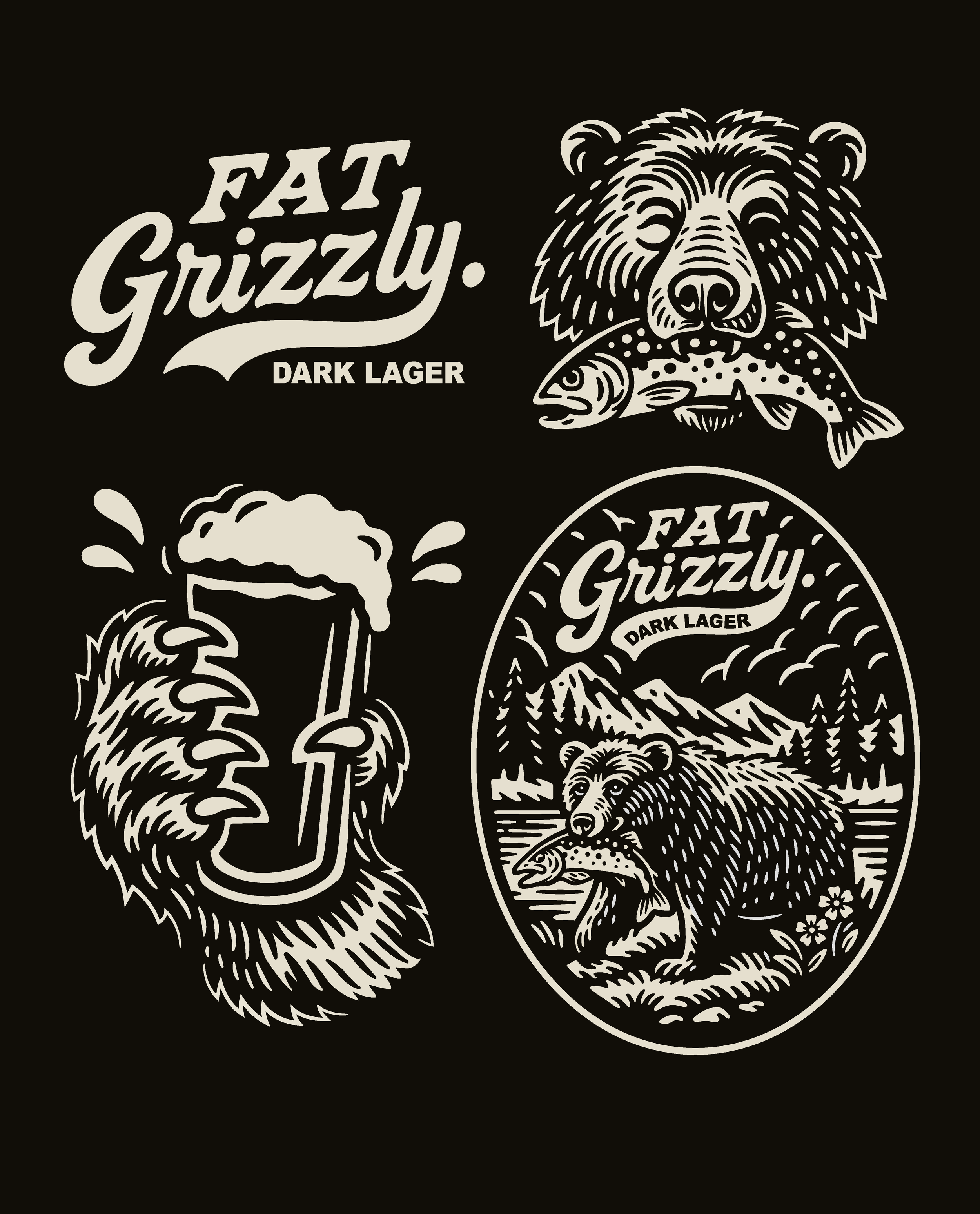
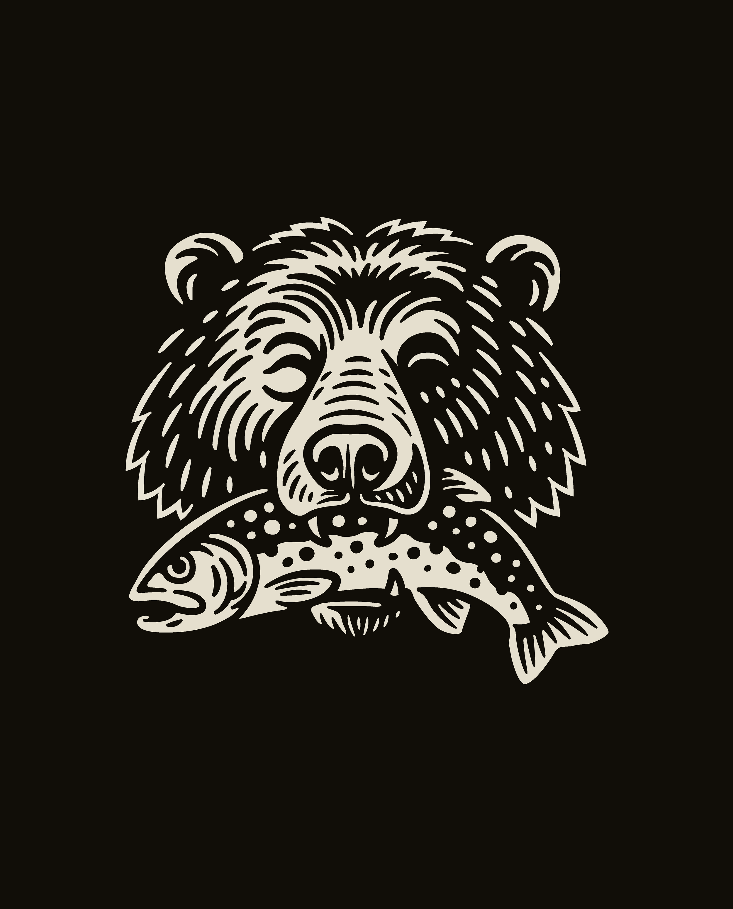
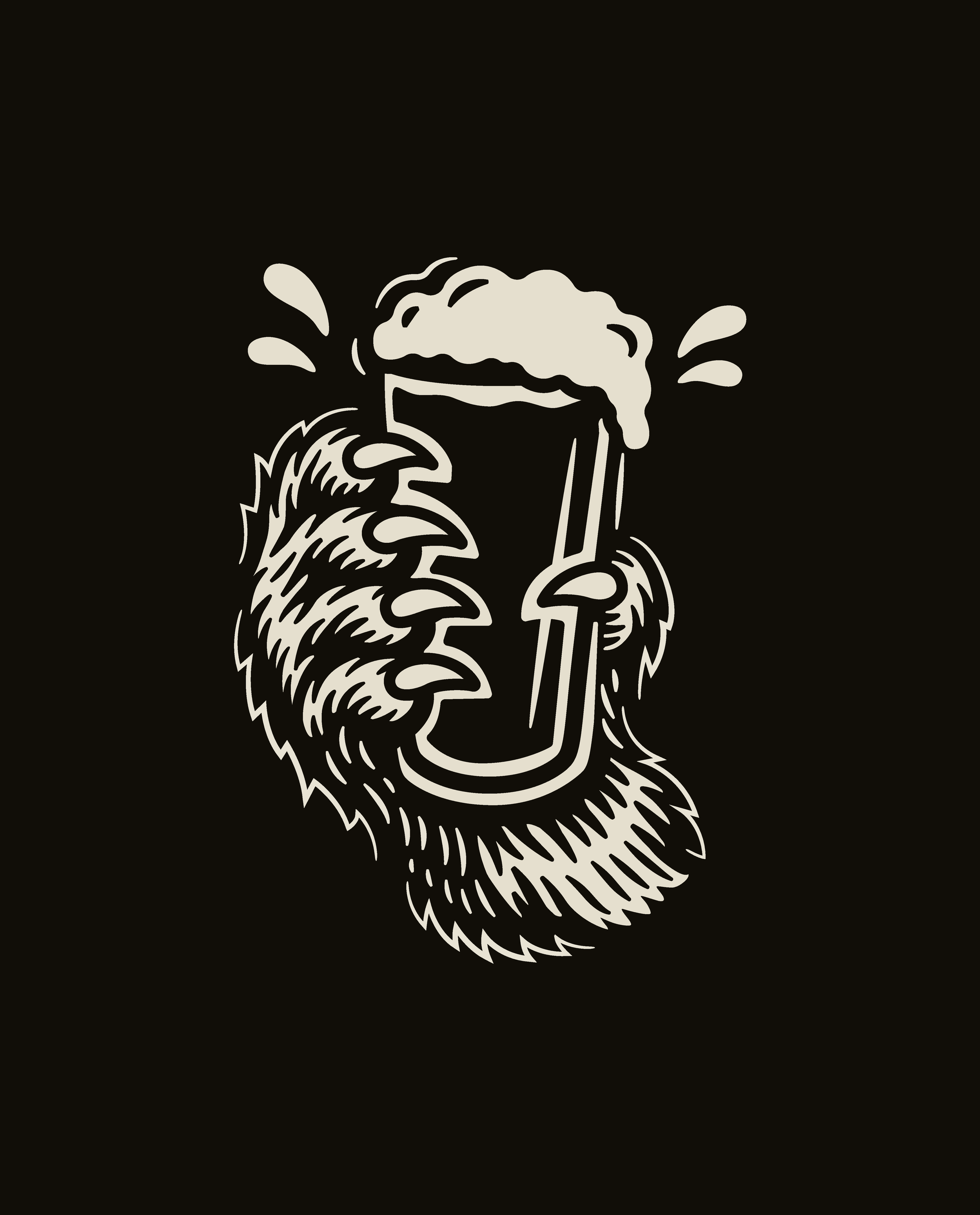
The direction draws from classic outdoor references, centred on a hand-drawn grizzly mark. The illustration uses strong line work and controlled texture to create depth while staying clear and effective across formats.
Typography follows the same thinking, confident and slightly rugged, designed to sit naturally with the illustration rather than compete with it. Supporting graphics extend the system, allowing it to scale across applications while keeping a consistent tone.
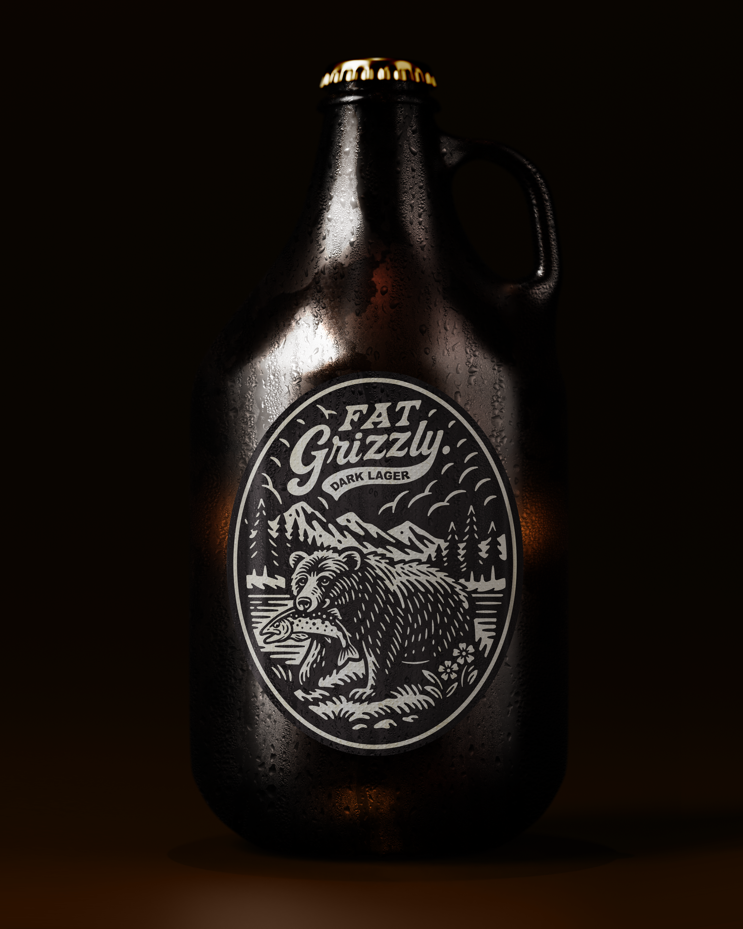
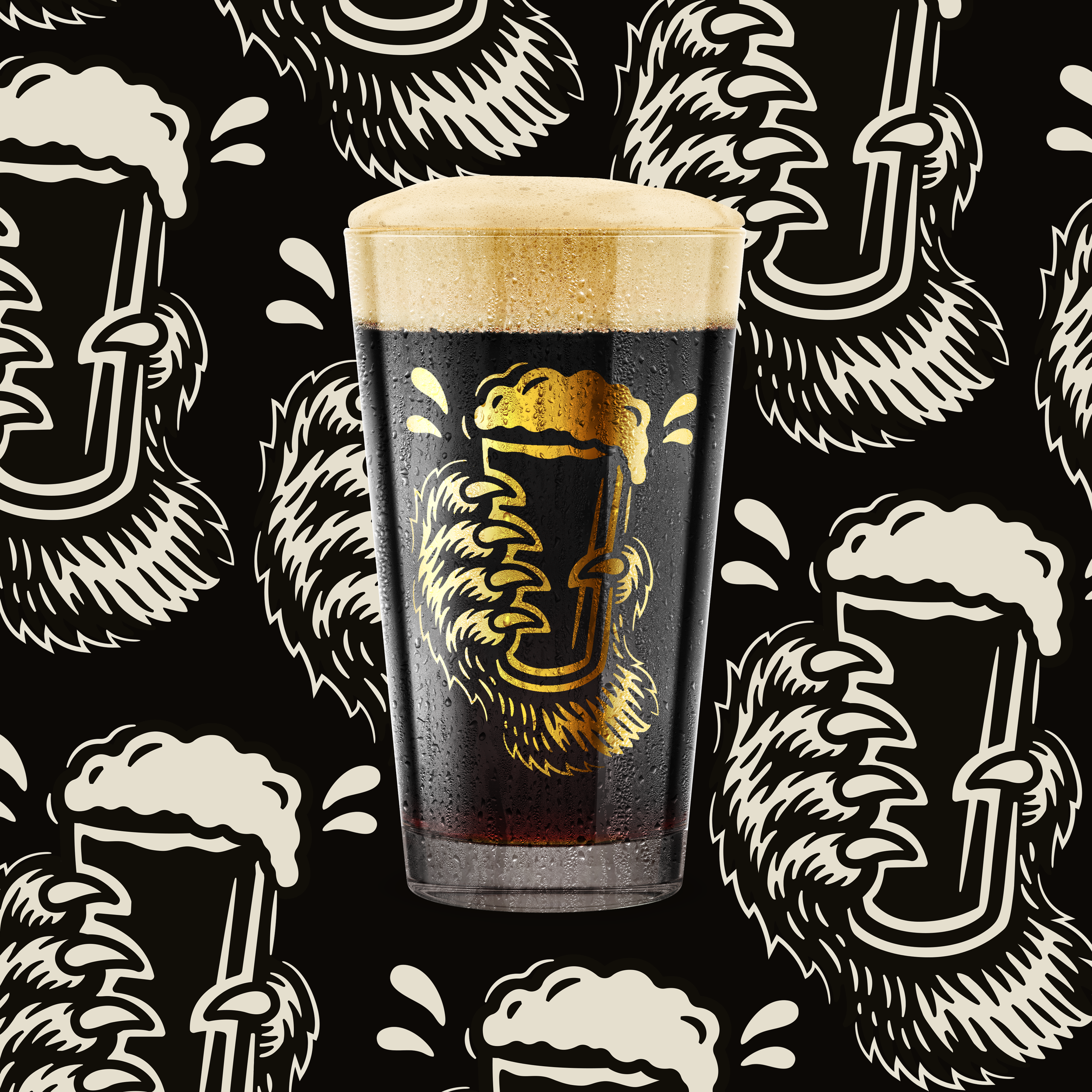
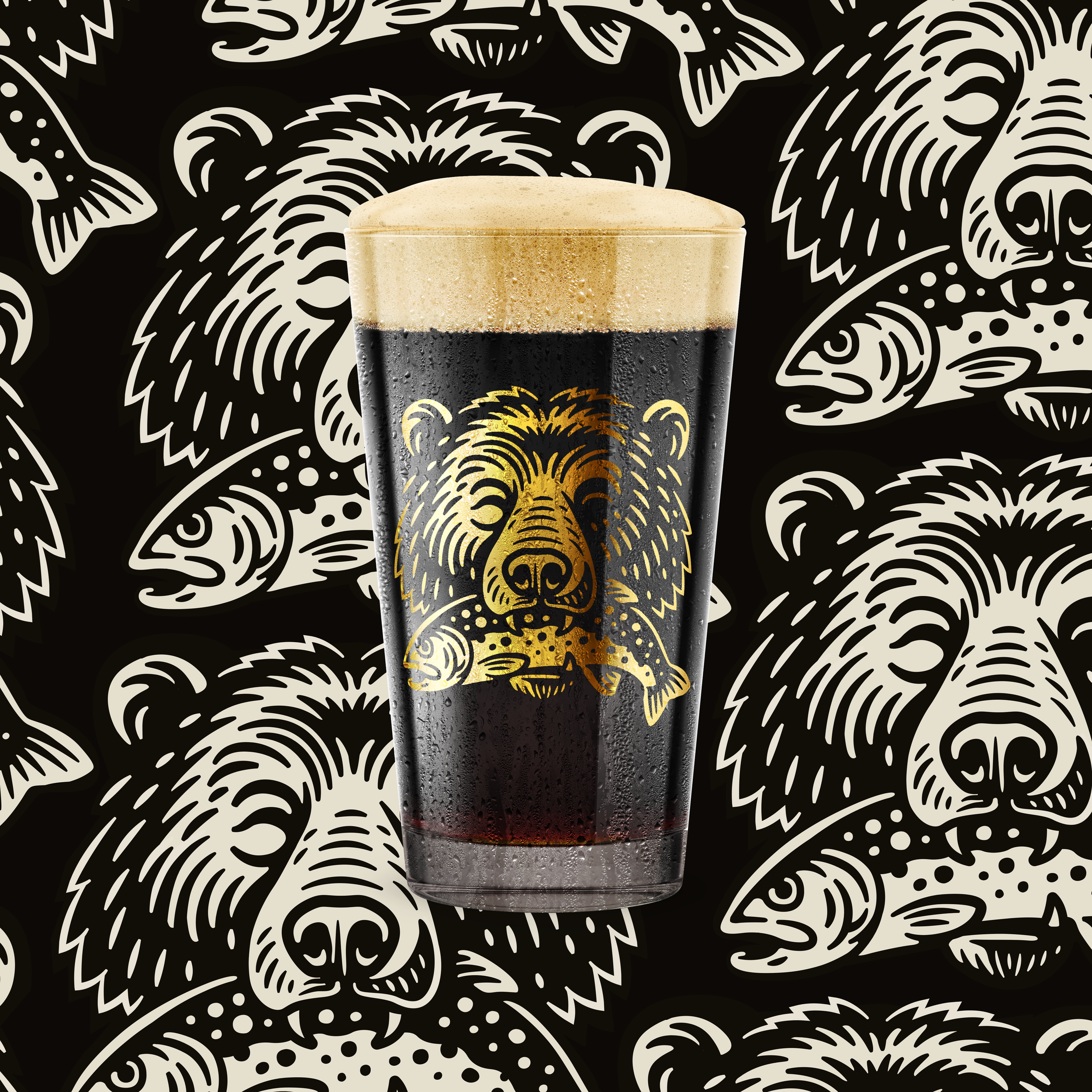
The growler format plays into the personality of the brand, reinforcing a more rugged, utilitarian feel and giving the identity a stronger physical presence beyond standard pack.
The result is a cohesive identity that feels grounded and distinctive, built to hold presence on shelf and across brand touchpoints.