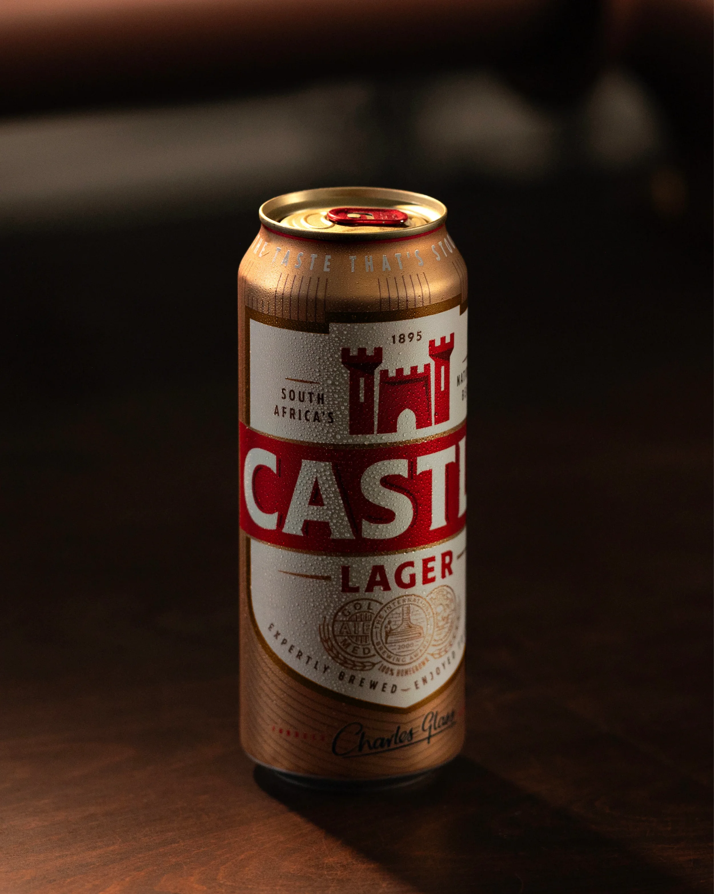
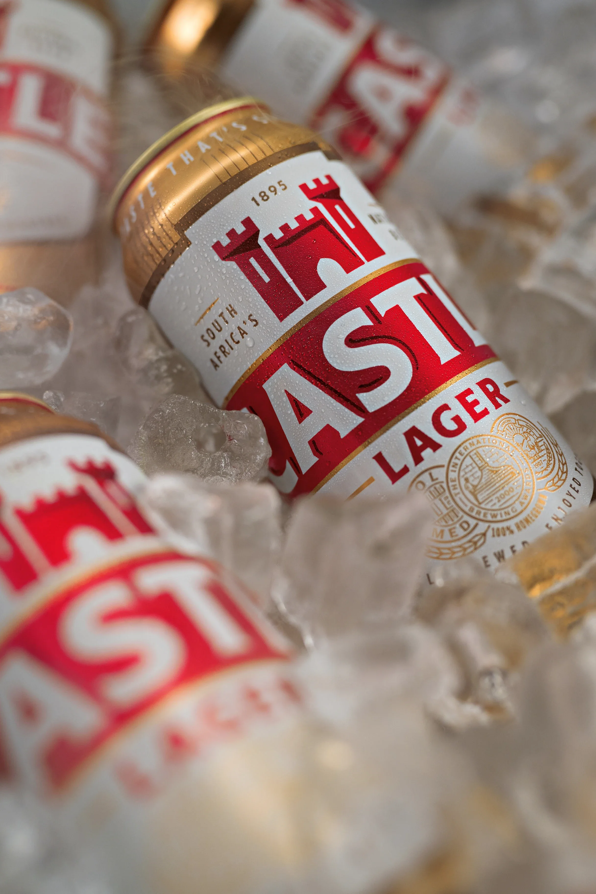
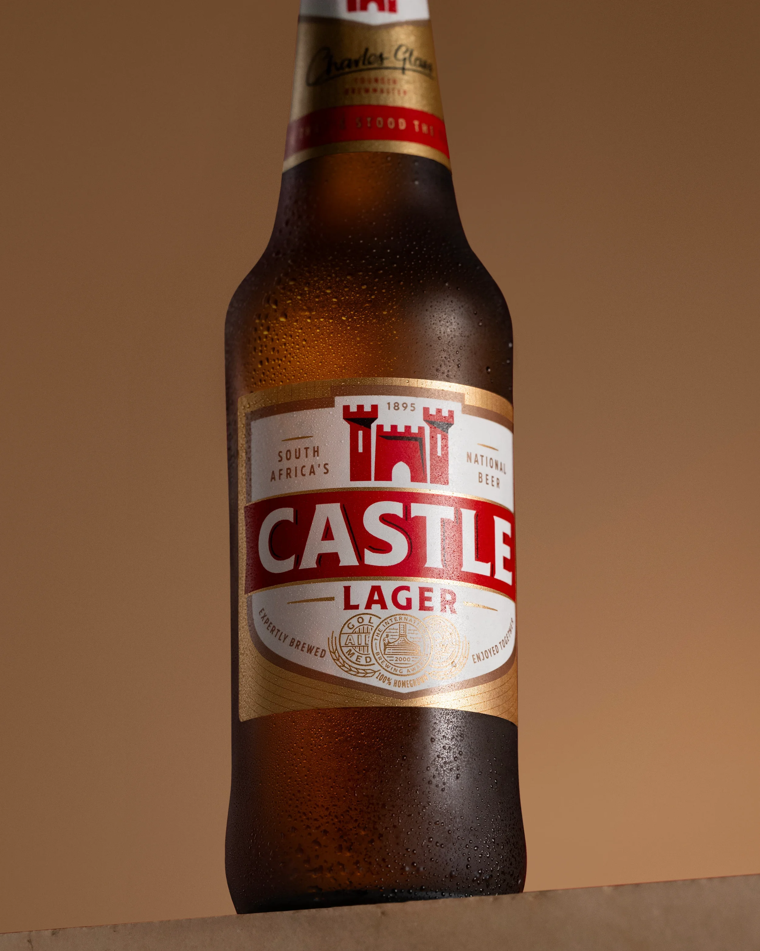
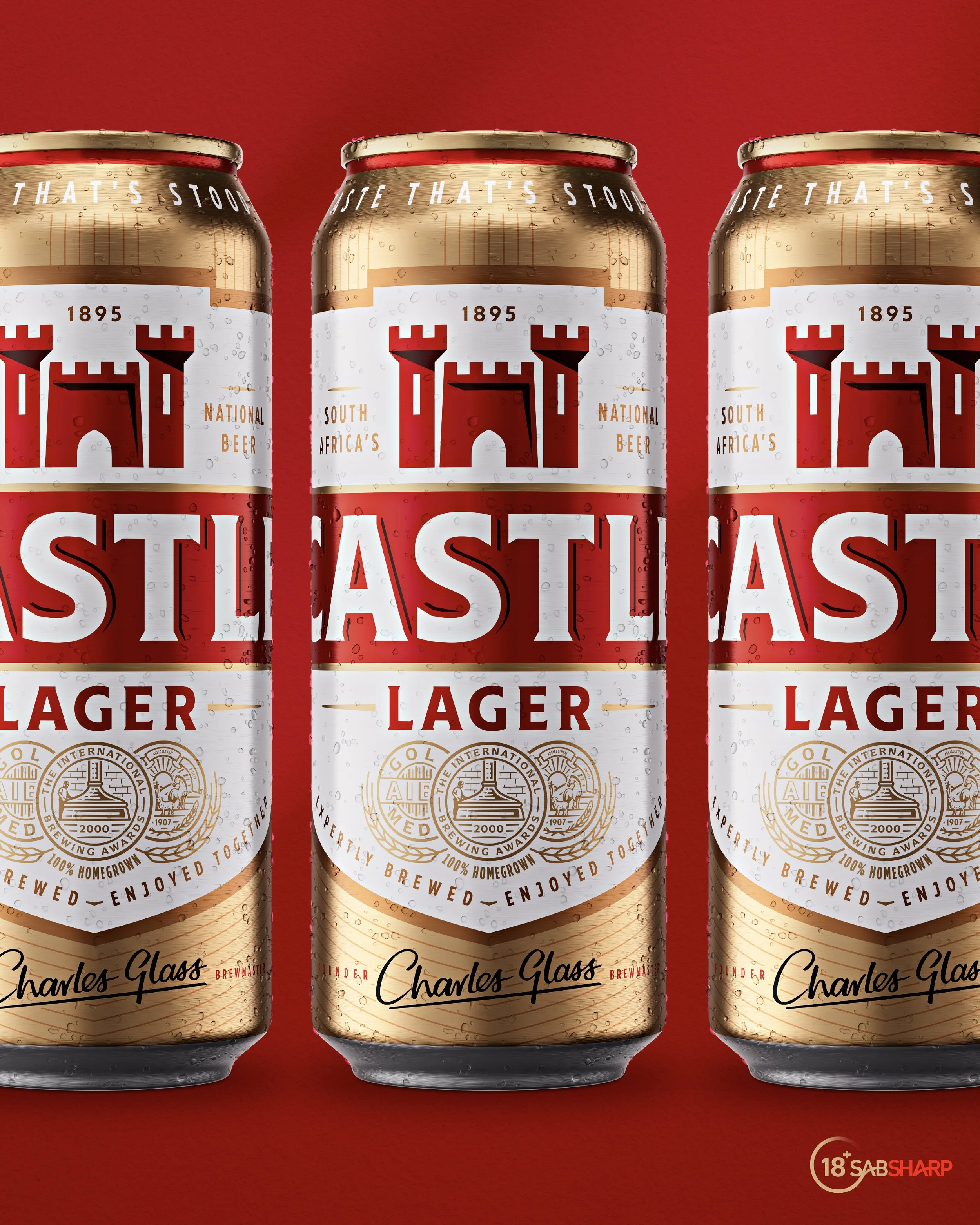
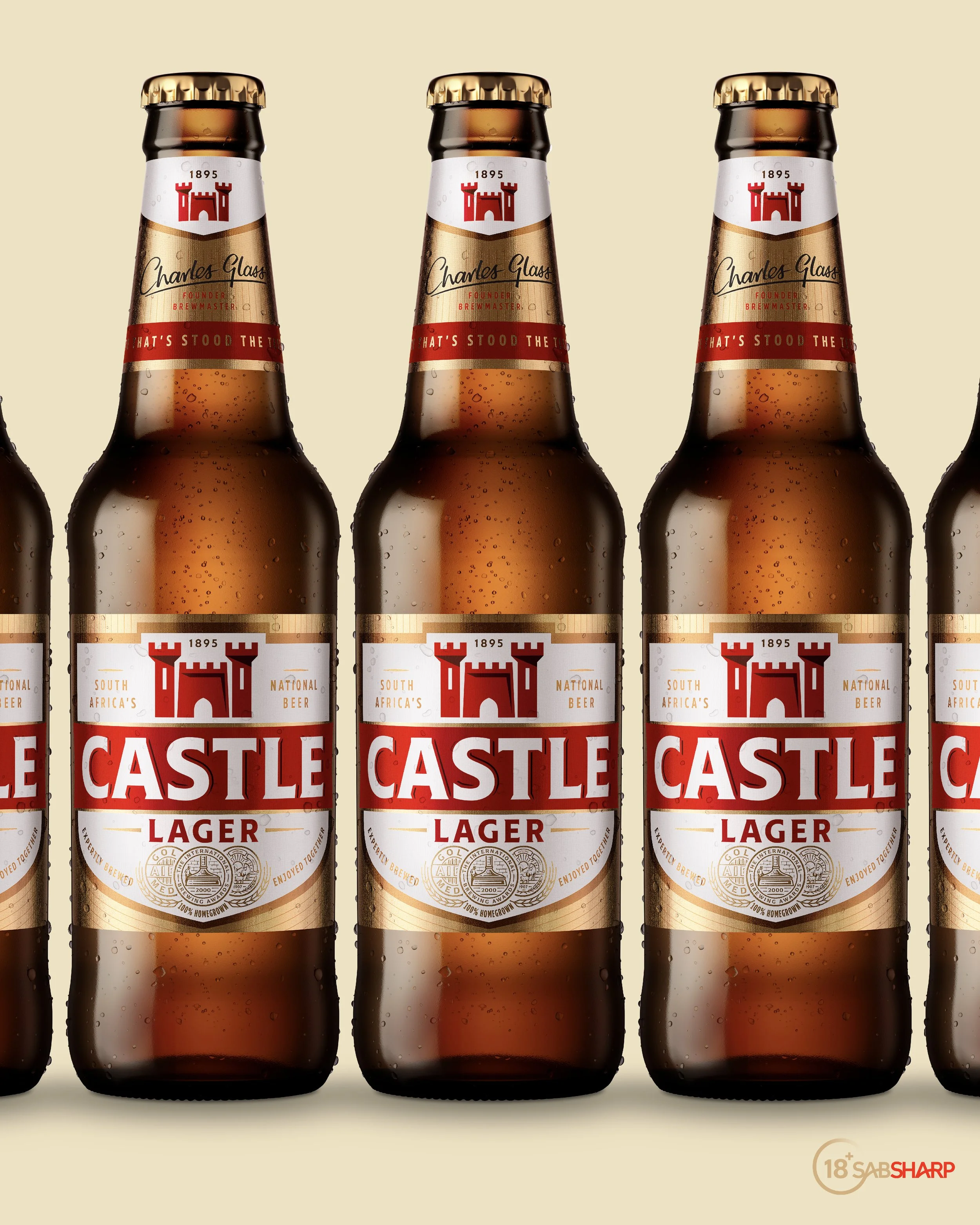
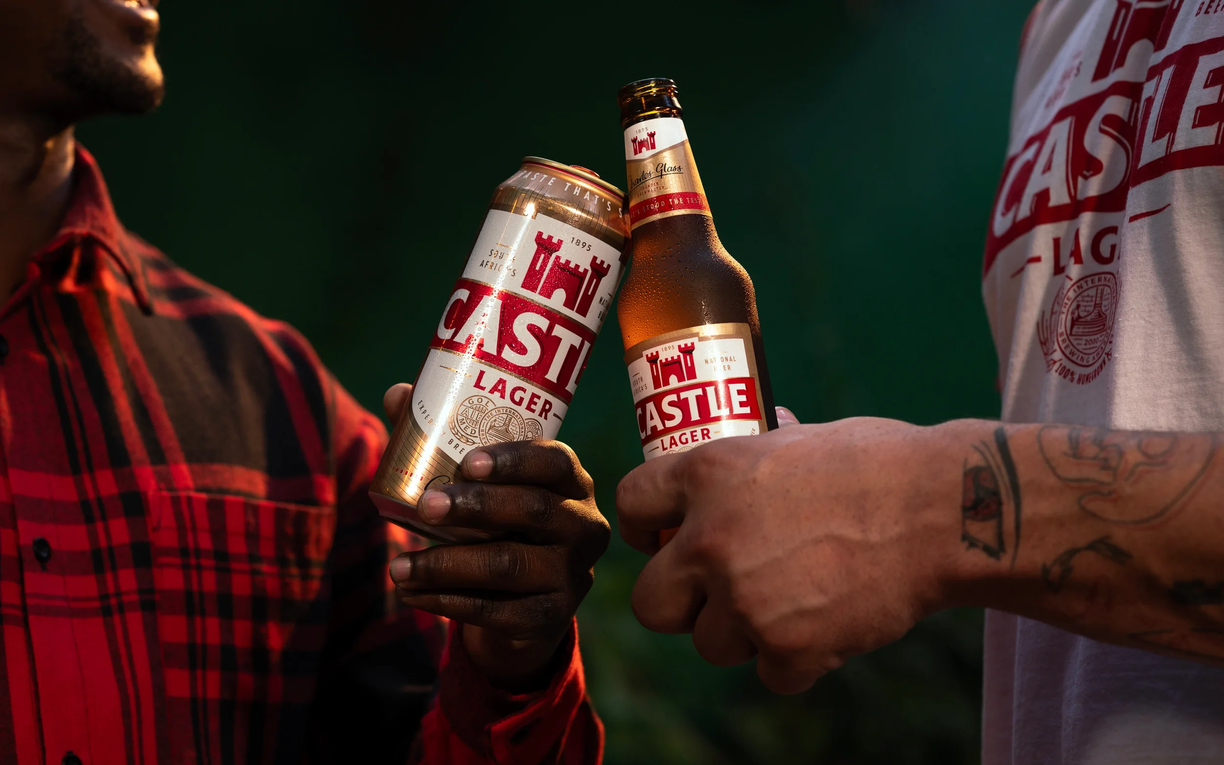
CASTLE LAGER
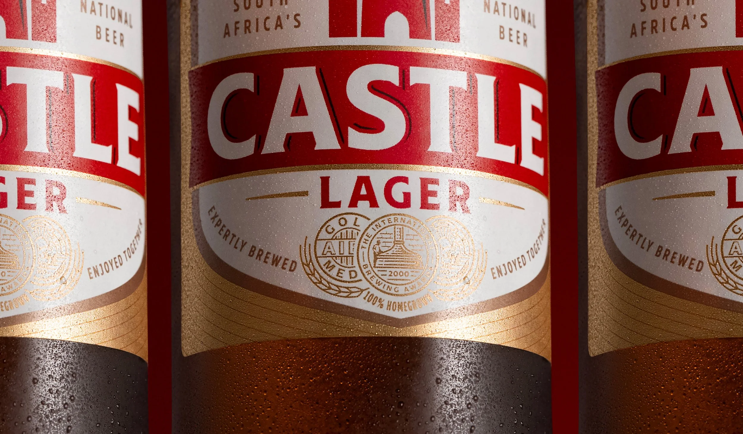
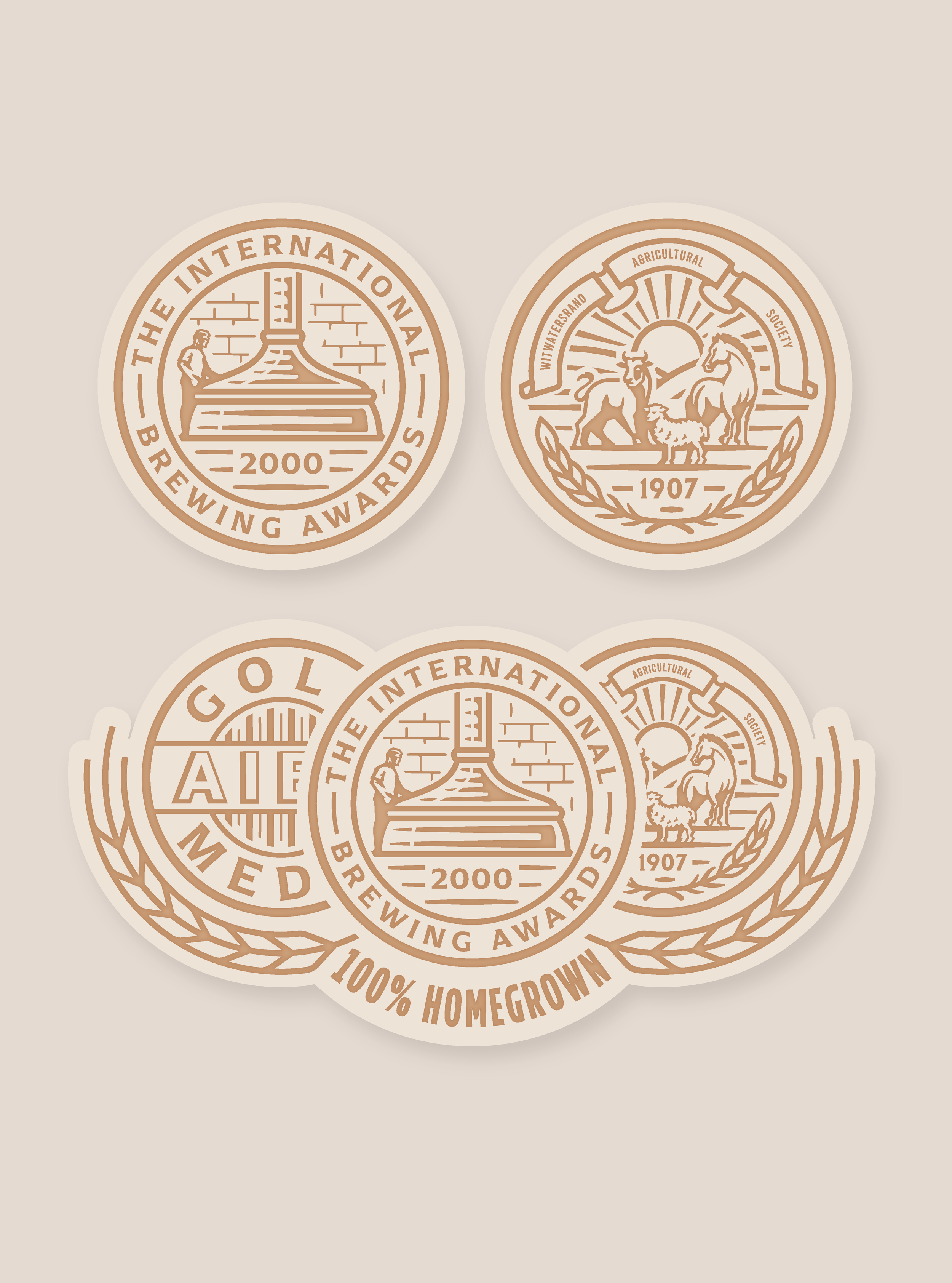
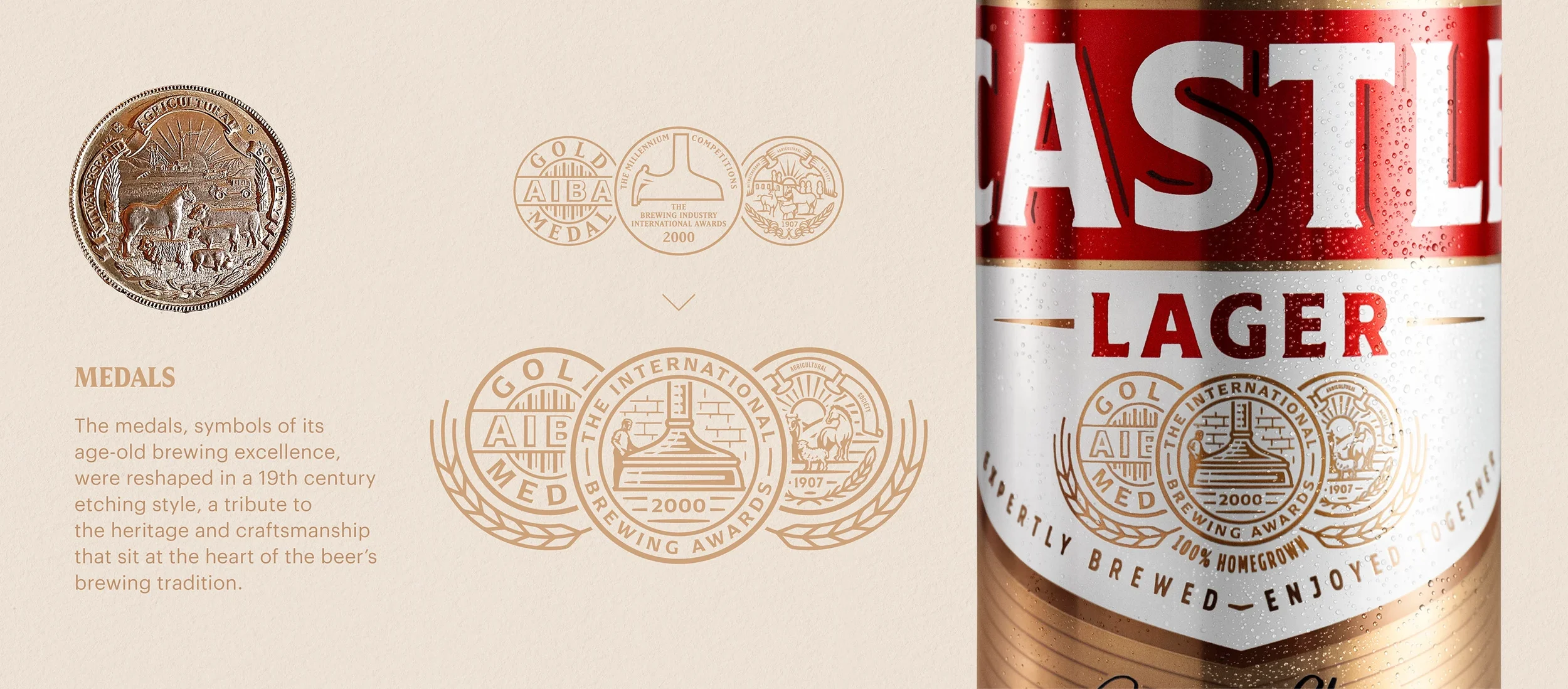
As part of Castle Lager’s broader packaging evolution by Shift Branding Agency, I was brought in to rework a set of legacy medal icons rooted in the brand’s brewing heritage.
The aim was not to simplify, but to reintroduce richness. Drawing from original references, the medals were carefully redrawn in a refined 19th-century etching style, balancing detail with clarity at pack scale. Each mark was treated as an asset in its own right, preserving historical character while aligning with a more modern, cohesive system.
The result is a set of icons that feel considered and intentional. Familiar, but elevated. Contributing to a packaging direction that leans into heritage as a point of distinction rather than something to be stripped back.